Return to Uzone News Portal

In today’s digital age, the use of mobile devices to access the internet is skyrocketing. With more and more people relying on smartphones and tablets to search for products or services, having a mobile-friendly website is no longer a choice—it’s a necessity. This article will explore why having a mobile-responsive website can significantly improve sales and help your business stay competitive in an increasingly digital marketplace.
Why is a Mobile-Friendly Website Important?

1. Enhancing User Experience (UX)
A mobile-friendly website provides a better user experience for visitors accessing it via mobile devices. A responsive design ensures that your website pages are easily accessible without the need to zoom in or scroll horizontally. This makes it easier for visitors to navigate and engage with your content, which ultimately boosts their satisfaction and drives conversions.
2. Improving SEO and Google Rankings
Google is increasingly prioritizing mobile-first indexing, meaning Google’s search algorithm will rank the mobile version of your website higher than the desktop version when determining search results. If your site isn’t mobile-friendly, you may lose visibility and drop in rankings, leading to fewer opportunities to attract potential customers.
3. Reaching a Broader Audience
With more people accessing the internet via mobile devices, a mobile-friendly website helps you reach a broader audience. Whether it’s potential customers on the go or users who prefer shopping on their phones, ensuring your site is optimized for mobile allows you to reach them anytime, anywhere.

4. Improving Site Speed
Website speed is a crucial factor in both user experience and SEO. Mobile-friendly websites typically load faster on mobile devices because they are optimized in terms of images, code, and other elements. Users tend to abandon slow-loading websites, which can harm your business’s chances of converting visitors into customers.
5. Reducing Bounce Rates
A high bounce rate typically indicates that visitors leave your website without further interaction. Non-mobile-friendly websites often have higher bounce rates because visitors struggle to navigate or read content. A responsive design that’s easy to access on mobile devices encourages visitors to stay longer on your site and make a purchase.
How Does a Mobile-Friendly Website Boost Sales?

1. Facilitating On-the-Go Purchases
With a mobile-optimized website, customers can easily browse products, add items to their cart, and complete transactions—whether they’re on the move or at home. This smooth buying process increases conversions and drives more sales.
2. Reducing User Frustration
Websites that are not responsive or difficult to navigate on mobile can cause frustration, leading visitors to bounce to your competitors. A mobile-friendly site ensures customers can easily find the information they need, increasing satisfaction and the likelihood of a purchase.

3. Building Customer Trust
When customers visit a mobile-friendly site, they feel more confident making a purchase. A professional, responsive website shows that your business understands customer needs and provides a seamless experience—this boosts trust and encourages repeat purchases.
4. Easier Access to Key Features
A mobile-friendly website allows visitors to easily access important features like menus, contact forms, or checkout pages. Using large, clickable buttons and simplified navigation ensures that users can quickly find what they’re looking for, increasing the chances of conversion.
Key Features of a Mobile-Friendly Website:
1. Responsive Design
Responsive design is the foundation of any mobile-friendly website. It ensures that your site adjusts seamlessly to the screen size of the device being used, whether it’s a smartphone, tablet, or desktop. Users no longer have to zoom in or scroll horizontally to view content.
2. Simple Navigation
Easy-to-use navigation is crucial for mobile users. Keep your menu concise and easy to access, with large enough buttons and links for easy clicking.

3. Optimized Page Speed
Optimize images, videos, and other elements to ensure that your pages load quickly, especially on slower mobile networks.
4. Easy-to-Fill Forms
Forms, whether for contact or payment, should be simple and easy to fill out on mobile. Avoid elements that make it difficult to complete forms on small screens.
Examples of Successful Mobile-Friendly Websites:
1. GoDaddy

GoDaddy is one of the best examples of a mobile-optimized platform for creating business websites. With a responsive design that ensures smooth navigation on mobile devices, GoDaddy provides users with easy-to-use tools to create mobile-friendly sites. Entrepreneurs can quickly build and manage their websites, ensuring a seamless shopping experience, which helps drive conversions and sales.
2. Shopify

Shopify is a leading e-commerce platform that enables businesses to create mobile-friendly online stores. Its responsive designs ensure a seamless shopping experience on mobile devices, allowing customers to browse products, add items to their cart, and complete purchases effortlessly. Shopify’s easy-to-use interface makes it simple for store owners to manage their sites on the go, driving conversions and increasing sales by providing an optimized shopping experience for mobile users.
3. Zara
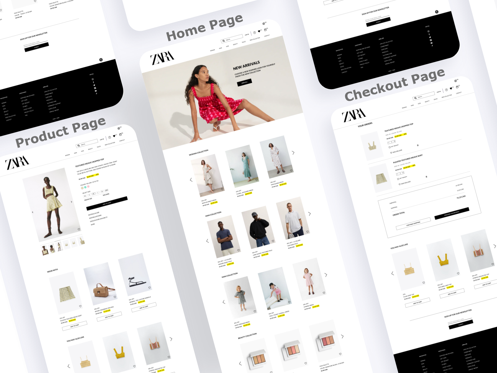
Zara, a global fashion brand, has optimized its site to provide a top-notch mobile experience. With a clean design and easy navigation, customers can quickly find the products they’re looking for, enjoy high-quality images, and complete their purchase easily. Zara’s site shows how a mobile-friendly design can enhance customer comfort and drive sales.
Conclusion:
Having a mobile-friendly website is essential not only for providing a better user experience but also for boosting sales and conversions. As more people access the internet through mobile devices, ensuring that your site is optimized for mobile is a smart move to reach a wider audience and maximize your business’s potential.
Call to Action:
Is your business website mobile-friendly? If not, now is the perfect time to make the change. Start by improving your design and boosting your site speed to make it more mobile-friendly. To help you with this process, consider reaching out to a web design expert or a digital agency that can provide the best solutions for your business!